As a full time blogger, as in, this is the job that brings in the income for the girls and I, I visit a lot of blogs. As a Campaign Lead for Collective Bias, I see a lot more in fine detail. There are so many amazing blogs out there that I have a hard time keeping up with them all. But some blogs have amazing content that I never can find. Whether it be a confusing navigation bar or other distractions, the little things keep the reader from sticking around. No matter how quality the content hidden within is. Now, my blog, ADayinMotherhood.com, is nowhere near perfect. But I spend a lot of time trying to make it as user friendly as I can. Companies and readers comment on the ease of use, the ability to find what they want to see and the easy way to contact me. As a blog reader, I want to email every single owner I see that has some of the things that turn me off (and possibly other readers) and say ‘Just stop it!’. Since I don’t have time to do that, I thought I would just share them with everyone. So, here are 14 Tips to Make Your Blog More User Friendly!
 1) Turn OFF the Music
Whether you have music that automatically plays when your page opens or ads that play music when the video is running, it is a serious distraction. Turn off the music! I don’t want to hear a song when I am looking at your content. In fact, I might have music on of my own, a sleeping child next to me or a headache I came to your blog to read about getting rid of. Music helps nothing on a website, as far as I am concerned. Unless you are a musician, it is more distracting than it is helpful. I almost always leave the sites with music playing instantly.
2) Stop the Pop Ups!
I was on a blog today that had a pop up. A huge photo of something that had nothing to do with anything I would be interested in. The worst part, though, is that I could not get it off the page. I could not see the ‘x’ and could not close it. I got out of the blog and got back in and – wala -there it was again. I am a blogger and I know that advertising income is key. But how much do you think you will make when people leave the site because all they see is a pop up and not the info they came to your page for? I was so frustrated I left. Please, stop the Pop Ups!
3) Please Link Me to Another Page

Bloggers have a lot of links. Whether it be links to affiliate partners, links to other posts on their blog or links to a Facebook or other social media page. But when that link opens in the same window as your blog and it takes me somewhere else, chances are I am not coming back to your blog for any reason. So, please, click the box that says ‘Open Link in New Page‘. Then I have to come back to you and might find something else I like that keeps me on your page longer!
4) Navigation is King
I am a bright girl. But when I come to your page to look at a recipe I saw on your social media page and I want to see more of the creations you have, please have a Recipe tab on your toolbar. Or a link in your post to your recipe page. Or some other navigable link that makes me stay and look around. If you don’t do a lot of recipes and this was a fluke, link me to something else on your page that might interest me. Like your marketplace that has the pan you used to make the said recipe. There are so many blogs with amazing content but no one can find it past the first page. Make us find more of what you do easily.
5) I Can’t See Your Navigation Bar?
The other day I was on a blog reading a very nice post about motherhood. I wanted to share it but got distracted. I clicked the Home button and then went on to do something else. Later, I wanted to share the post and went back to the main page of the blog. It took my eyes a while to find the Menu bar that told me the categories of the blog. I finally found it, faint and overrun with decorative flowers. I never did find the article again but I did find a tip for you. Make your Navigation bar easy to find and read! Clean, bold print that draws the readers eye to all of your content!
6) Social Media Buttons Have to be Seen!

Along the same lines of the easy to see Navigation bar, please make your Social Media Buttons easy to see (and make them open on a new window). It is highly recommended by so many blog experts to make the buttons the same color as the Social Media Page. So Royal Blue for Facebook, light Blue for Twitter, Red for Pinterest, and so on. A reader’s eye knows those colors and they are drawn to them on your page. But if they can not see them – or worse, have to search for them – because they are teacup shaped and all the same color or hidden behind colorful displays that blend them in – it is harder for the reader to click them. Any reader who might possibly follow you on Social Media needs to be able to find those buttons and know what they are instantly.
7) Where do you Photos Go?
Please, I beg of you, link your photos (to open in another tab, of course). There is nothing more frustrating than seeing a gorgeous photo and clicking it just to get a larger gorgeous photos. If it is a craft or recipe, link it to your main craft or recipe page. Or if the recipe was possible because of a certain dish, link it to that dish on your affiliate partner’s site. But please don’t leave it hanging with no place to go. Now, some photos – like photo disclosures – don’t need to go anywhere. In that case, delete the default link so that the photo is un-clickable.
8) Pin It? How?

Pinterest is a HUGE driver of traffic right now to a lot of blogs. So having a Pin It! button on your site is key. Having one pop up on your photos is vital. I use PinIt! Pro. It allows readers to hover over my photo and click the button to pin instantly. There is a Free PinIt! Button too. But I feel the custom one ads your own personality to the PinIt! Button! Make it big so people can see it and instantly pin with little effort.
9) Grammar Equals Quality
Now, listen. I am no grammar and spelling expert. I have readers tell me ALL THE TIME that I have spelling errors. You might even find some in this post. But I get less when I actually read the post again – often out loud – before I hit publish. Commas are your friend. Run on sentences are not. A positive message is wonderful, but not if it includes double negatives. Try to put out a grammatically correct post with no spelling errors and your quality meter will go up with everyone from readers to companies to little ole’ me.
10) Copy, Paste – Correct the Font
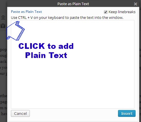
We all do it. We copy and paste a quote, a comment, a set of words from email or something else to our blogs. But then we leave the font because we can not figure out how to change it to what we have already typed. So mid-sentence, the font changes. It is very distracting to the eye to have that happen. So take the time to paste the content into the text only part of your site and let it default to the correct, fluid text, throughout. Keep the font the same throughout your post.
11) Please PLEASE Do Not Abbreviate Your Title
OK, so this one I have noticed more and more. Titles should be clear and spelled out. Crock Pot Chicken Alfredo with a Twist. Now CP Chicken Alfredo w/ a Twist. OK, so that is an exaggeration to show an example. But it gets the point across. First of all, Google (tell me if I am wrong), can not index correctly with abbreviations. Secondly, it looks…. lazy. Things like Recipe should be spelled out. Rec. tells me nothing. GW and REV does not tell me the same thing as Giveaway and Review. Make your title the queen’s crown of the post. You don’t want to confuse us. You want us to click on it. So spell your titles out.
12) Whose Photo is It?
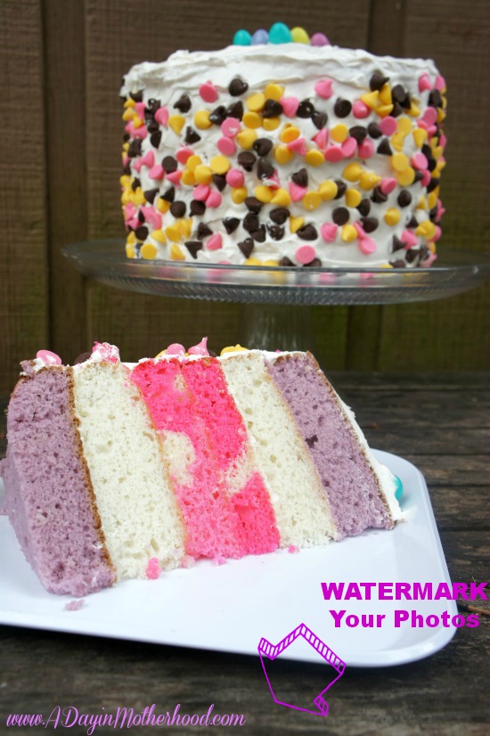
With images becoming the most important thing in most posts now, you have to own them. If you took them, with your own camera, in your kitchen, own them. Watermarking, or putting your link on them, makes them yours. So when someone less hard working than yourself comes along and clips that photo and uses it and claims it as their own, you can go to them and say, ‘Hey, here is my original watermark. It is mine!’ Then you have recourse with Social Media sites and hosts. Plus, if I see something beautiful I want to know who took it so I can go to your blog and see more amazing shots!
13) How do I Find This, That and The Other?
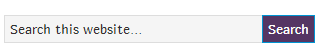
Search buttons need to be LARGE, easy to find and available to readers. I can not tell you how many times I have wanted to look for something on a blogger’s site and a) no search button was to be found anywhere or b) it was stuck somewhere odd that I only found by searching for hours. OK, minutes, but still. Let people look around. Search buttons are easy to install and work wonders to keep people on your page!
14) How do I find YOU?
Want me to contact you? Then tell me how! I would say more blogs do not have Contact Me Buttons than those that do. A Contact Me page does no good when I am searching 100 blogs for a possible job. I want to see your beautiful, smiling face and a large CONTACT ME button that I can click that goes to a form that actually goes to you. Companies stroll sites all the time and if they can not find you, the project can’t either. So get one. Now.
Now, I realize that I am no blogging expert. But I have learned a few things. Most from really amazing bloggers who educated me along the way and a lot from readers who were kind enough to tell me what they prefer. So I would say all that is in this post is from really good sources!
Readers, what would YOU like to see on every blog to make it more user friendly? And Bloggers, what do you think I need to add or take off this list? I am still learning so I am all ears!
Want more great advice? See How to Blog: My Best Advice for Growth and Success!

Thank you Lori – you gave me some stuff to think about. :) <3
You are so welcome!! :)
Thanks for a great article. It hit on a lot of my pet peeves. Especially not having a Pin button!
You are so welcome